Media Center
Explore our news, press releases, media assets, publications, and official resources
This space brings together all our corporate communications, designed for journalists, partners, healthcare professionals, and stakeholders seeking to stay informed about our latest developments.
Here, you’ll find our most recent press releases, media kits, official publications, visuals, videos, and key resources to better understand our mission, innovations, and global impact in the pharmaceutical field.
December 10, 2025
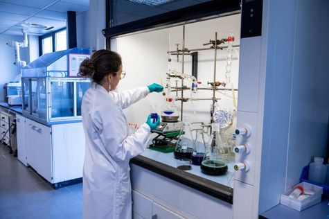
Provepharm expands presence in medical dyes and enters fluorescence era
See more

September 9, 2024
Provepharm launches Blumyne™ surgical dye in UK
See more

September 9, 2024
Provepharm launches Blumyne™ surgical dye in UK
See more

April 1, 2024
Publication of our CSR 2023 brochure
See more

November 29, 2023
Provepharm obtains B Corp™ certification
See more

November 8, 2023
Provepharm launches UK subsidiary
See more

August 8, 2023
Bringing the Malaysian healthcare industry to greater heights: Provepharm and Pharm-D join forces to provide “Proveblue® 5 mg/ml solution for injection” in Malaysia
See more

July 19, 2023
Provepharm celebrates its quarter century
See more
October 13, 2022
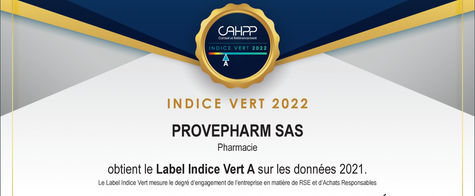
Provepharm obtains the "Green Index mention A" label
See more

